Topps has taken on one of the more ambitious and creative projects the hobby has seen in a while. It’s far more inspired than “When in doubt, Chrome it out.”
Topps has commissioned artists to recreate some iconic baseball cards with their own flair. It’s called Project 2020, and these remixed cards have proven quite popular all year long. Right now, there’s nearly 400 pieces of art turned into cards, and collectors have been gobbling them all up.
This week, Topps revealed a new Derek Jeter rookie card with a decidedly 90s New York spin. It’s modeled after a Seinfeld DVD, which is both perfectly simple and weird and fitting. Jeter’s ascent into superstardom ran more or less parallel to Seinfeld becoming the most popular show on television. (Sometimes they intersected too, like when Buck Showalter was fired as the Yankees manager on the show, and then it happened in real life a couple weeks later.)
At the Loupe offices (okay, just our Slack channel), we’ve been passing around our favorite Topps Project 2020 creations all year long. We figure it’s time to round some of them up to share with you.
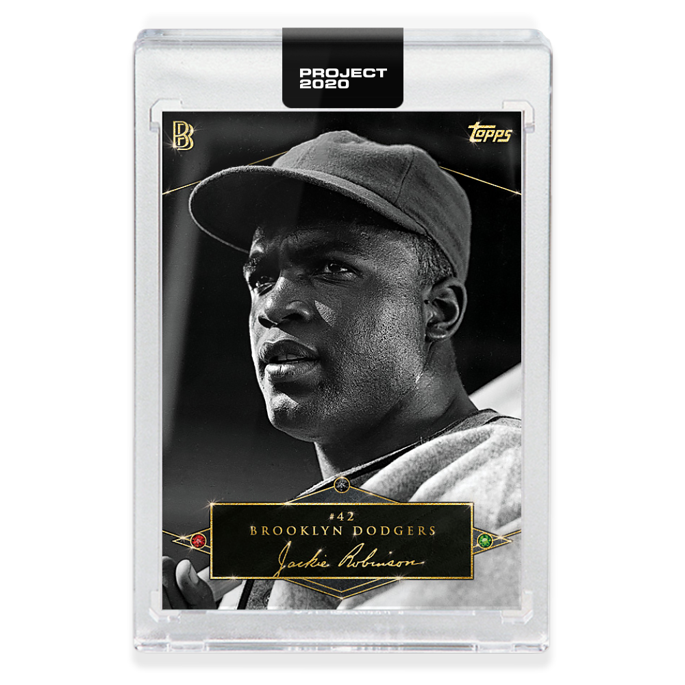
1952 Jackie Robinson by Ben Baller
Ben Baller is known for his ostentatious approach to his art. He’s a jeweler, and his forte is making everything very shiny and expensive. If you have a piece iced out by Ben Baller, everyone knows what’s up.
That’s why it’s so remarkable and perfect that this Jackie Robinson card is so restrained. Just a couple of jewels around his name, and a little bit of shine around the edges. It’s nothing but class for a barrier-breaking legend.
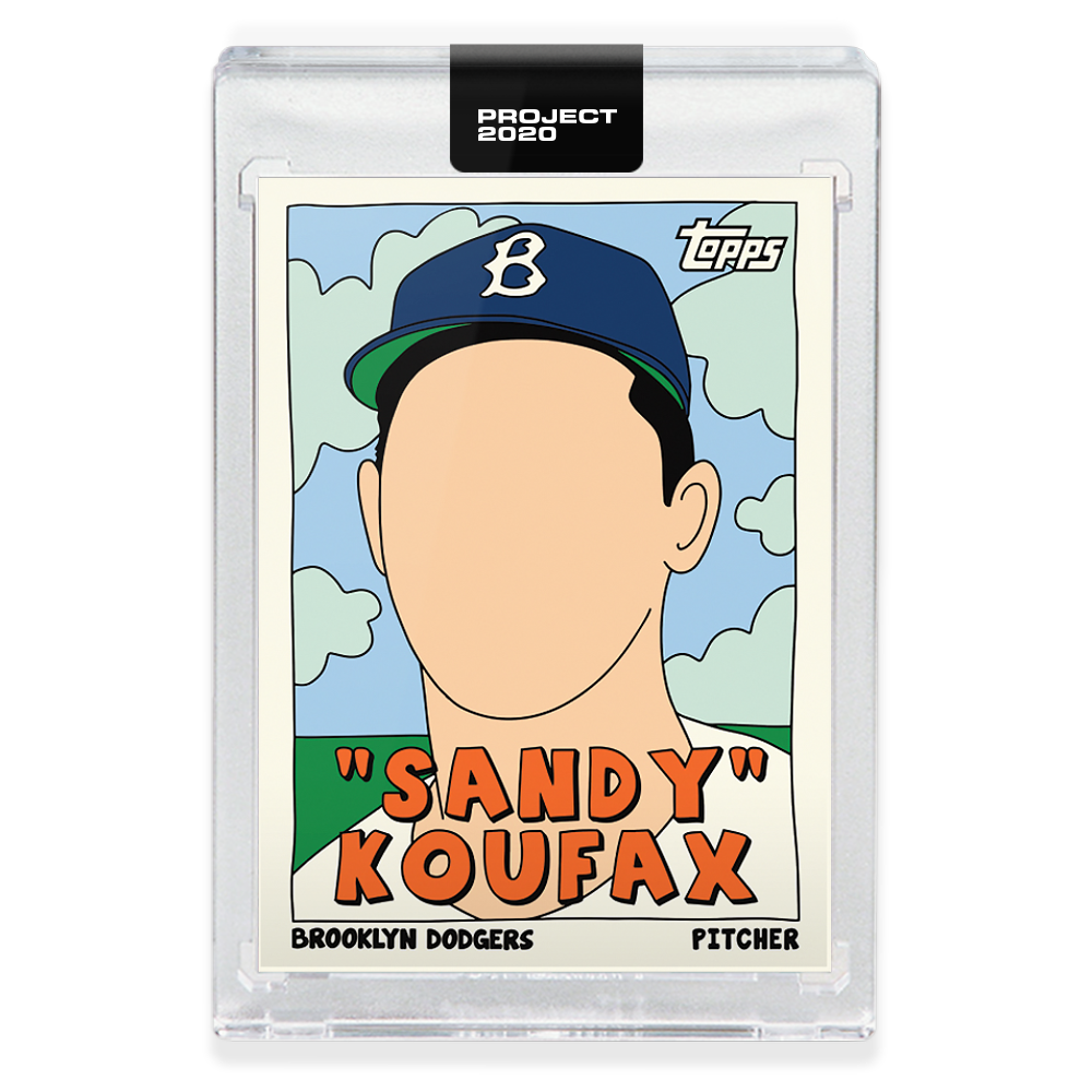
1955 Sandy Koufax by Fucci
Fucci’s thing is post-pop style with no faces. It has translated differently across the several cards the Toronto-based artist has made for Topps. Sometimes the lack of facial features draw your eye to something more interesting that’s happening on the card.
And then there’s this Sandy Koufax card where his face is the only thing to look at. It makes for a big blank mug. This might be the single card in the whole set that I think is the most ridiculous. At least the clouds are pretty.
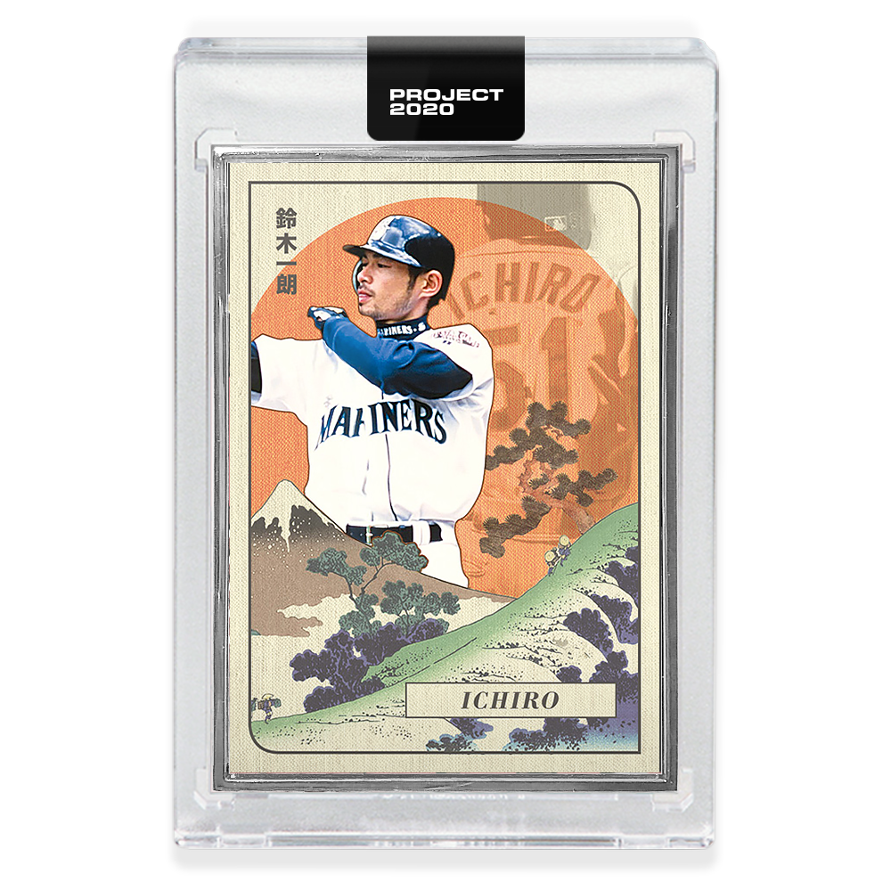
2001 Ichiro by Oldmanalan
Oldmanalan has the most photorealistic and grounded approach of the Topps Project 2020 artists, and maybe that means his cards won’t get the attention that some of the more outlandish approaches get.
But this 2001 Ichiro card is sheer brilliance. Ichiro, with his trademark at-bat prep, backdropped against the Japanese countryside and the rising sun. It’s a beautiful card that commemorates the culture of one of baseball’s most picture-perfect hitters.
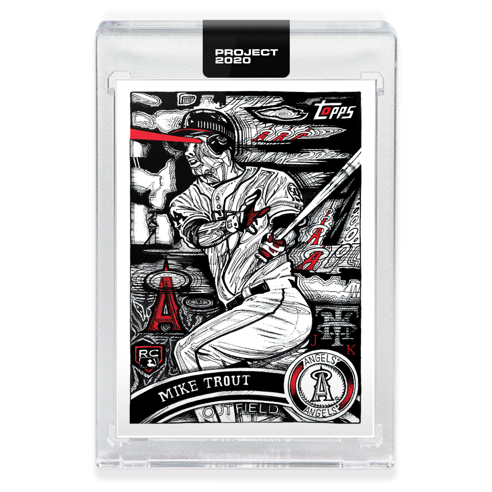
2011 Mike Trout by JK5
Truthfully, I don’t even know what to say about JK5’s take on Mike Trout’s rookie card. It’s wild. It’s extremely mechanical and Trout is shooting laser beams out of his eyeballs. We’ve all suspected that he’s a baseball-smashing cyborg. JK5 is just confirming our suspicions.
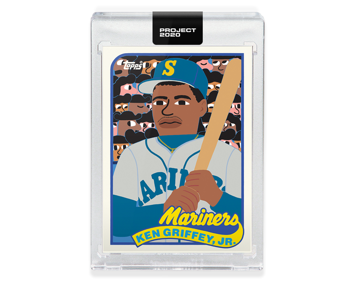
1989 Ken Griffey Jr. by Keith Shore
Chances are you either love or hate Keith Shore’s style. I can see how his approach could be polarizing.
But I think this Griffey Jr. card is worth highlighting because it has a childlike splendor that reflects The Kid’s approach to the game. It’s the reason so many of us fell in love with him so many years ago, and I think Shore’s style does a good job of capturing that by reimagining an iconic card.
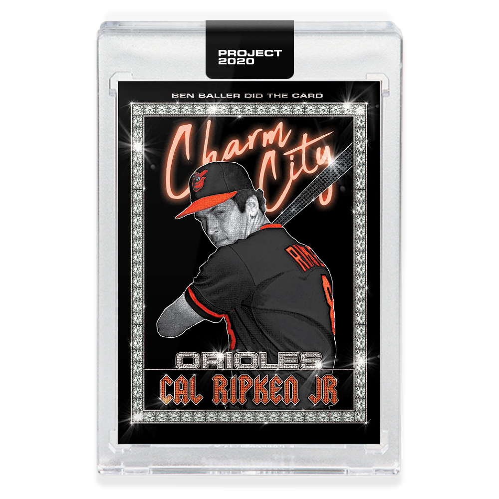
1982 Cal Ripken Jr. by Ben Baller
We’re back to Ben Baller for a minute. Remember the stuff I said up top about how he ices everything out? That’s perfectly exemplified in this Cal Ripken Jr. card.
I can’t get over how unintentionally hilarious this card is. Like, Ripken seems like the last dude on earth who’d wear a chain. I bet he hates that there’s a bunch of diamonds around his name. This seems like the antithesis of repurposing a card to represent a player in a different light. I love it for that.
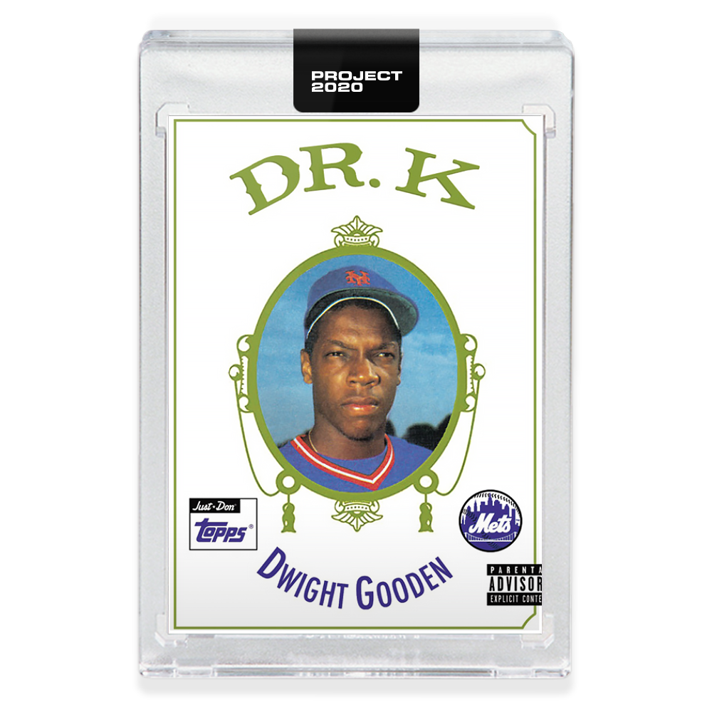
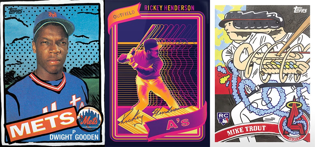
1985 Dwight Gooden by Don C
At long last, we’ve arrived at my very favorite card. Don C took strikeout maestro Dwight Gooden and put him on Dr. Dre’s The Chronic‘s cover. Wonderfully, it’s titled “Dr. K.”
Everything about it is perfect. Gooden’s mean-mugging exactly like Dr. Dre does on the cover of the 1992 album. The name couldn’t be more fitting. It even has a parental advisory sticker. This is a card that I’m compelled to go buy on eBay right now.
I guess you could say it’s “Nuthin’ but a K Thang.”
1 thought on “Our favorite Topps Project 2020 designs so far”