I hope you’ve had a great weekend, Loupe fam! Looking for a quick break from taking advantage of our app-wide 20% off Summer Sale and want to kick back with some light hobby-related reading? You’ve come to the right place.
If you’re on this app, chances are you’re already well aware of Topps Project70. For anyone who isn’t familiar, Topps teamed up with 51 different artists to create an ongoing, season-long set of uniquely designed baseball cards to celebrate their 70th anniversary. It’s easily one of the coolest things currently going on in the hobby, and I for one already have a budding collection of them.
Given that there’s so many different artists drawing inspiration from countless sets and players, they’re truly works of art and impossible to compare. With that being said, today I’m going to discuss and compare my five favorite cards of the set so far! Keep in mind this is 100% opinion-based, and I’ll probably think of 10 more that I forgot to include after this goes live. But that’s the fun of blogging, so here we go!
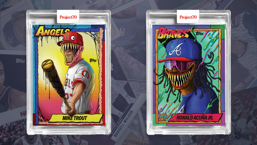
T-5. 1990 Mike Trout & Ronald Acuna by Alex Pardee
Is any Project70 list complete without these iconic cards? The two highest selling P70 releases to date feature many similar qualities, and both are equally awesome.
Trout and Acuna are two of the most featured players in the set, but none stand out quite like Pardee’s. The cartoonish teeth, bright colors, and attention to detail take these cards to another level, making it no surprise why 40,000 combined base cards were printed between the two.
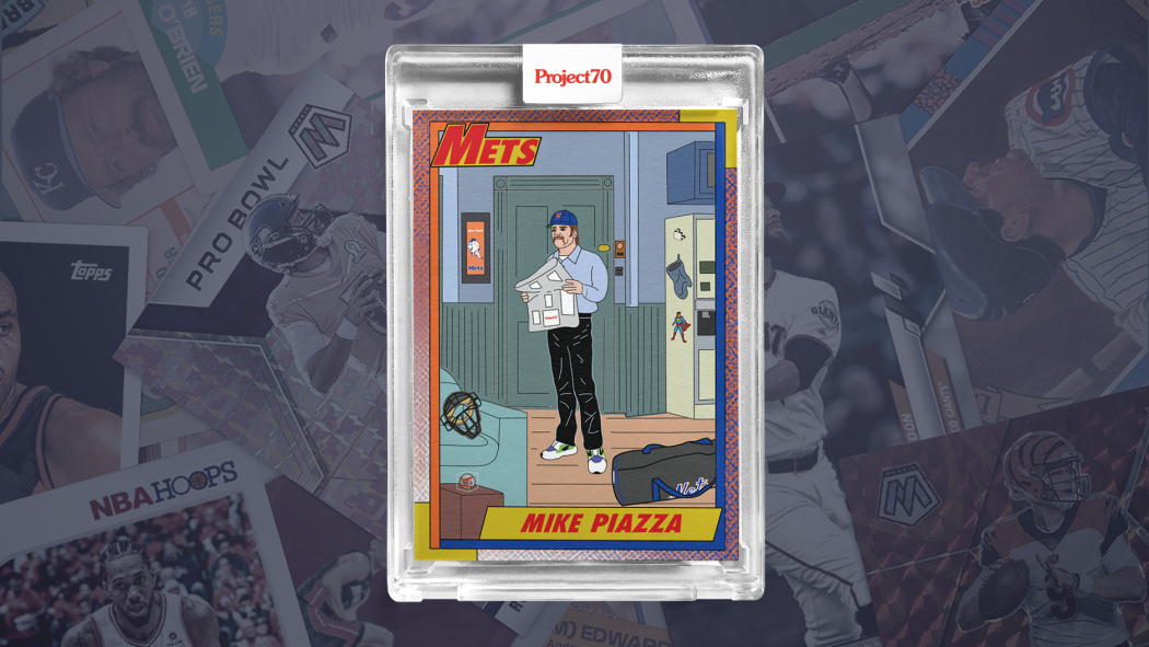
4. 1990 Mike Piazza by Oldmanalan
Can I make a confession? Until I went to write this blog post, I had no idea this card drew inspiration from the same Topps set as the aforementioned Trout and Acuna. Obviously when you look at the cards you can see the border/font placement is right out of 1990 Topps, but the designs themselves couldn’t be more different.
Oldmanalan’s 1990 Mike Piazza may be #4 on this list, but it’s #1 in my heart. Two of my favorite things in the world are Seinfeld and baseball, so this card may have been the quickest purchase I’ve ever made. Never before did I think an officially licensed Topps trading card would have Mike Piazza in Jerry Seinfeld’s apartment, but that kind of ridiculousness is what makes Project70 as great as it is.
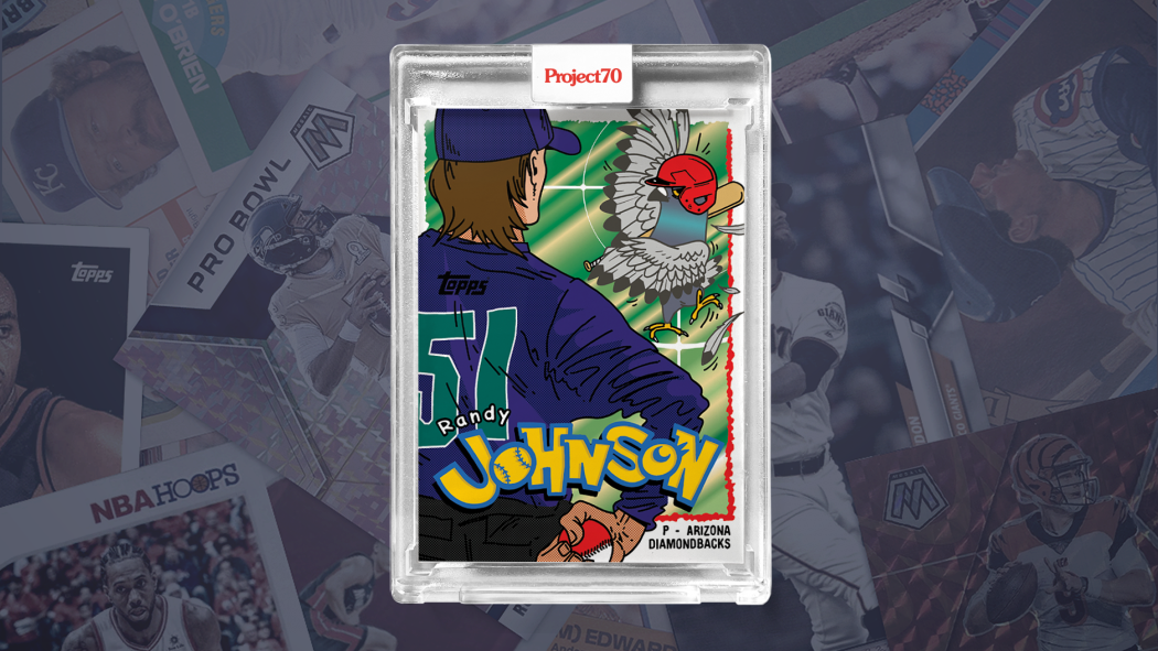
3. 1995 Randy Johnson by Ermsy
As soon as Project70 was announced, you knew there were going to be plenty of Randy Johnson/bird designs. It’s one of the most iconic stories in baseball history, and there’s so many different ways it can be incorporated onto a card. What I didn’t expect, however, was the direction Ermsy took.
A Pokémon baseball card is exactly what the hobby community needed, and the execution was flawless. Seeing Randy Johnson staring down the bird like a Pidgey on Route 2 cements this card in my top three of P70 thus far.
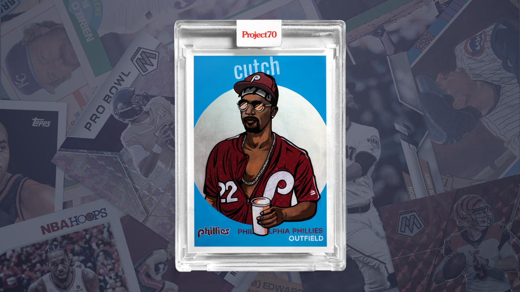
2. 1959 Andrew McCutchen by Blake Jamieson
The argument could be made that this card should be #1 on any list using “cool” as a measuring stick, and quite frankly it’d be tough to disagree. For the longest time this was my absolute favorite card in Project70 (until #1 came out, which you’re about to see) and it’s clear to see why.
The photo of McCutchen this card draws inspiration from is the definition of cool, and Blake Jamieson is one of the best in the business. Combining that photo with one of the most iconic vintage Topps sets of all time, with the subtle use of the “Cutch” nickname made this a highlight of P70 from the day it dropped back in February.
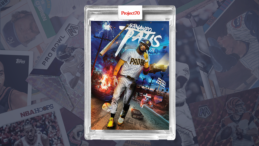
1. 2020 Fernando Tatis Jr. by DJ Skee
As a White Sox fan it pains me to write about this one (damn you, James Shields!) but is there really any other choice for the top spot? Tatis is the new face of baseball hitting dingers and flipping bats all over the place, so obviously he’s one of the most-used players in Project70. However, I believe the design that best captures his essence is DJ Skee’s.
There’s so much going on in this card, and it’s pieced together perfectly. One minute you’re staring at the eye-popping dark blue background with flying cars, and the next you realize there’s a bat and baseball that almost looks like they’re jumping off the card in 3D. A player with a loud personality needed a loud card, and the multi-talented DJ Skee designed exactly that.
Which card has been your favorite so far, and how do you feel about Project70 as a whole? Sound off in the comments below!